Digital Editing Tutorial 101
Hello and welcome back to the Splat blog!
I hope you’ve been keeping well, healthy and staying home. These are unprecedented times we live in and with us spending so much of our lives indoors right now, I had a recent request to create a digital editing tutorial. And of course, I’d be delighted to show you how! So if you want to find out just how I create my funky edits, keep on reading!
P.S this tutorial is designed for Adobe Photoshop users (and provided you have a basic understanding of the program!) :)
Step 1: Set up your file & choose your image
Instagram uses a 1080x1080 pixel format for their photos, so it’s easiest to simply set up your art file to be the same size to avoid that irritating cropping. I use those above dimensions and also keep it at 150 ppi for extra clarity.
Once you’ve done that, it’s time to find a good picture! I use a mixture of images of myself and favorite rock stars from the ‘60s, but you can choose absolutely anything you wish.
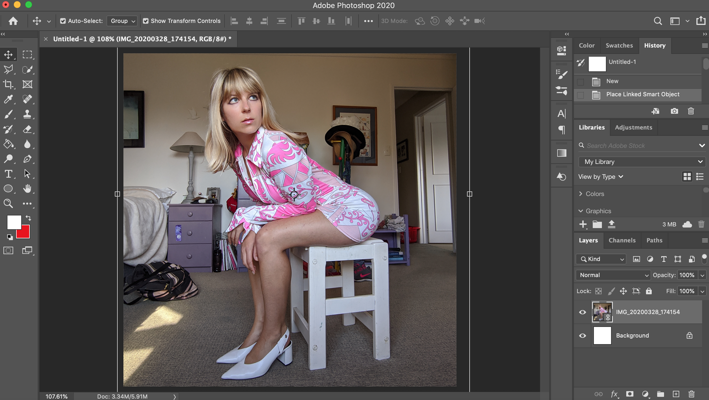
First things first: get yourself an image, and set up your file correctly! You don’t need to be Irving Penn to get the kind of shot you want (I sure as heck am no photographer!)
Clear cut time!
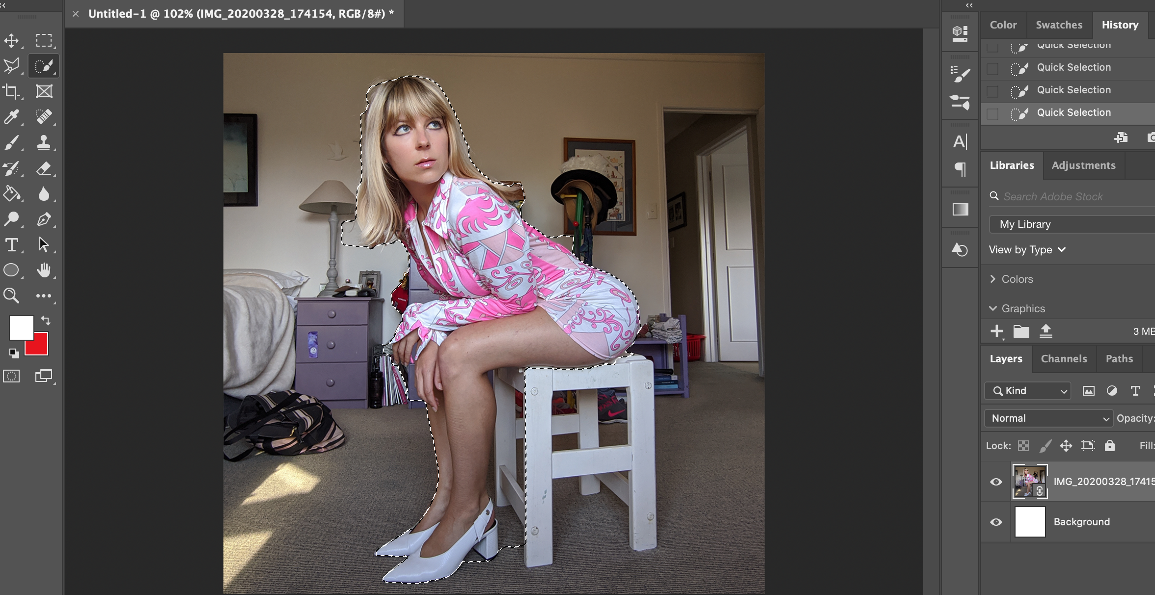
Erase and tidy up everything around your chosen person/image/thing
Step 2: Clear cut the image & tidy it up
For any graphic designers out there, you might be internally rolling your eyes at this step, but it’s a necessity here! Grab the Quick Selection Tool or the “Select and Mask” option, and select every aspect of the person/thing you want to cut out and isolate for the edit.
I tend to be quite messy here in terms of what I’m selecting, so don’t worry about being perfect. Just grab the general shape of what you want, then jump into your “Layers” tab, and select “Layer via Copy.” This will cut out the image from the original background and so leave you with just the image you want.
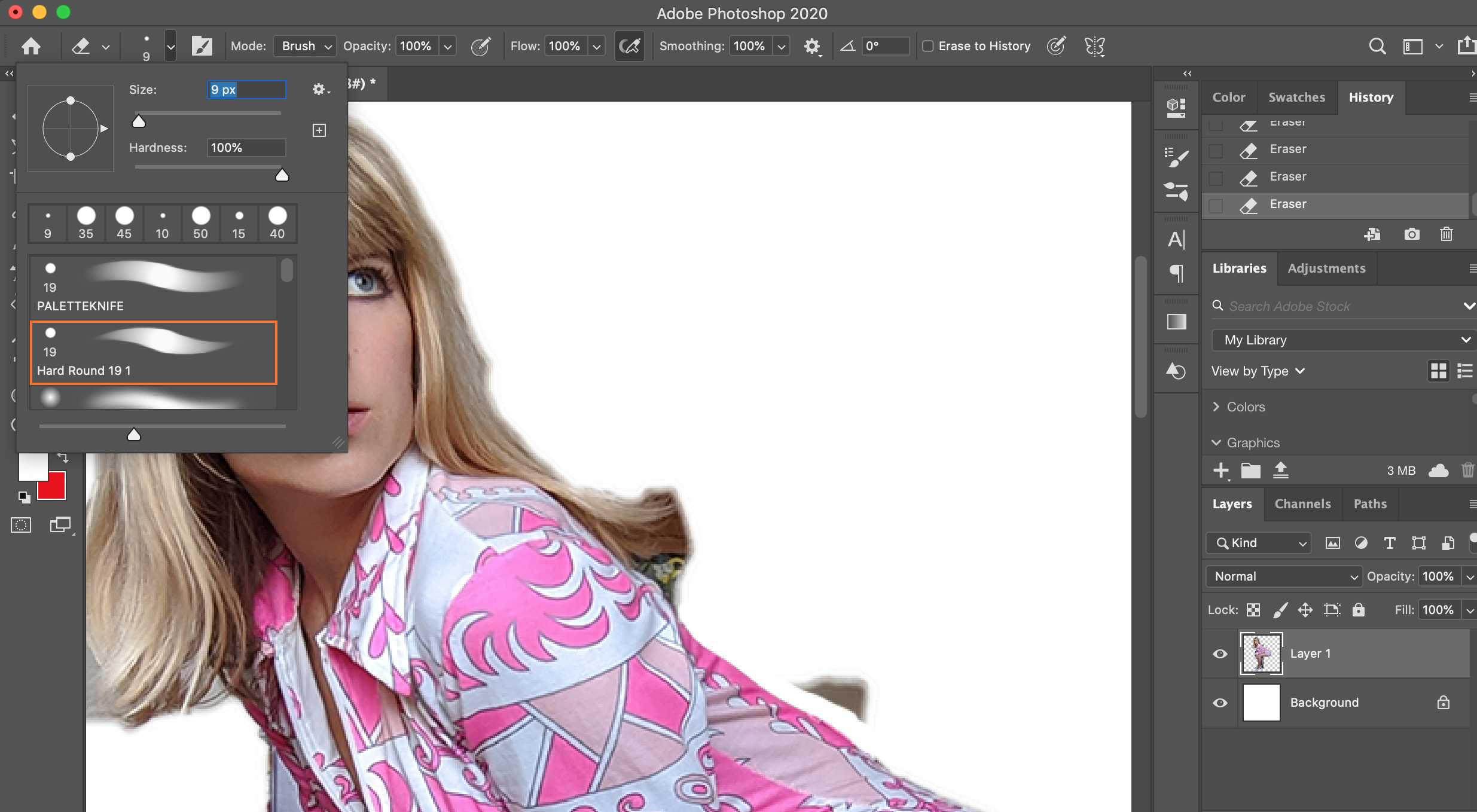
Got that? Now what you want to do is grab your eraser tool and set it to a dense/hard brush. This way, you’ll cleanly tidy up the image and not have any remnants left over that might look crappy later on.
Be aware: This step DOES take a little while. But, once your image is clean, you’ve got the perfect canvas to do with what you will!
Camilla’s Quick Tip: Once you’ve clear cut your image/shape, take the blur tool and put it at a 20% opacity, and lightly blur round the edges. This will soften the image so it doesn’t look too sharp on the background you’re about to create.
Step 3: Bump up the lighting & colour
Done that? Guess what - that’s the hardest part done!
Now that’s finished, it’s time to sharpen up colours, brightness, you name it. You call the shots here, so you decide how bright you want it. I use everything from Brightness/Contrast, Curves, Vibrance, Shadows/Highlights and Photo Filter (all combined) to achieve the perfect colour effect for my image, and this is so it looks more in-line with my psychedelic aesthetics.
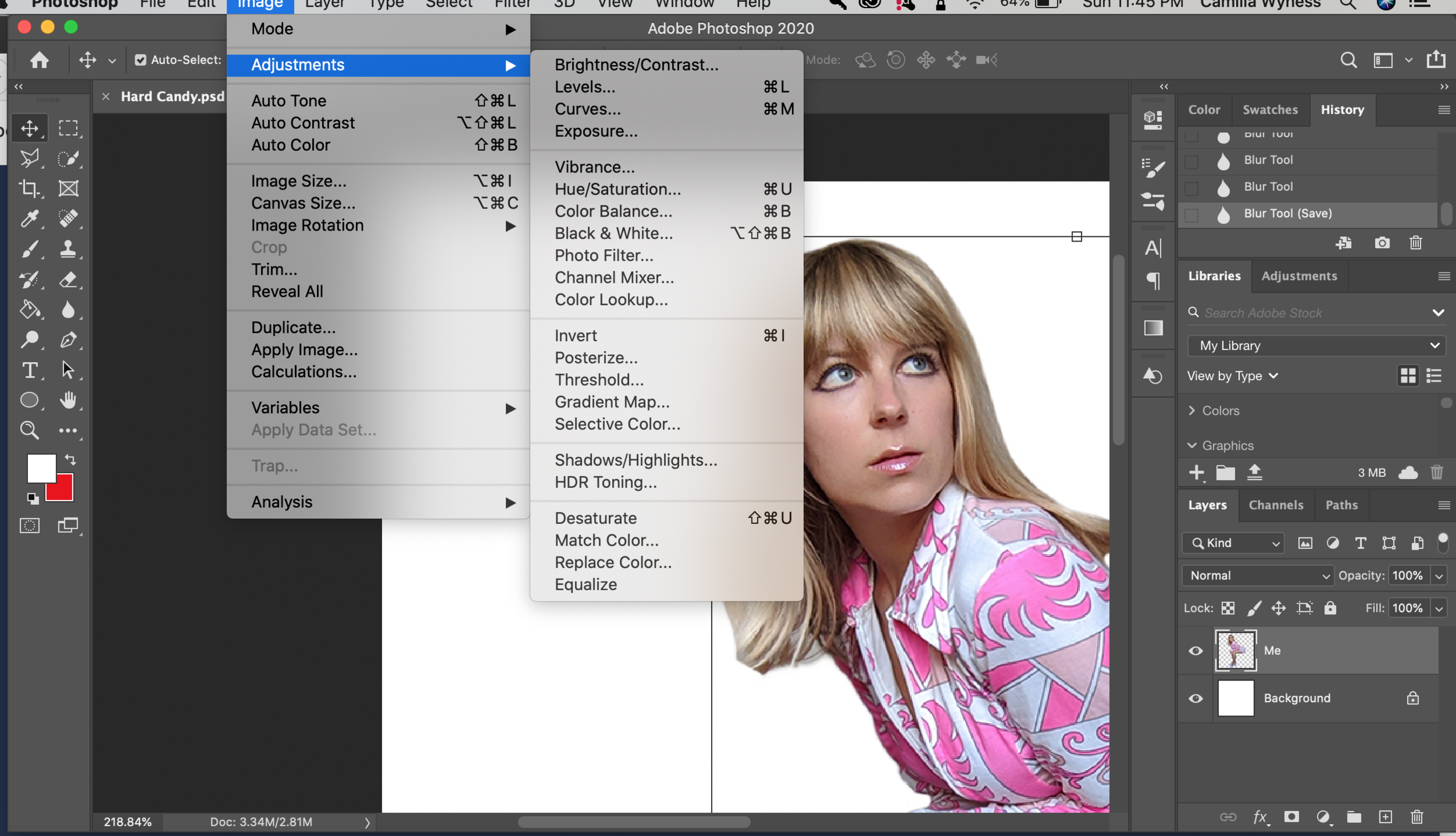
Sharpen up your colour and contrast now
So many colours, but which to choose?
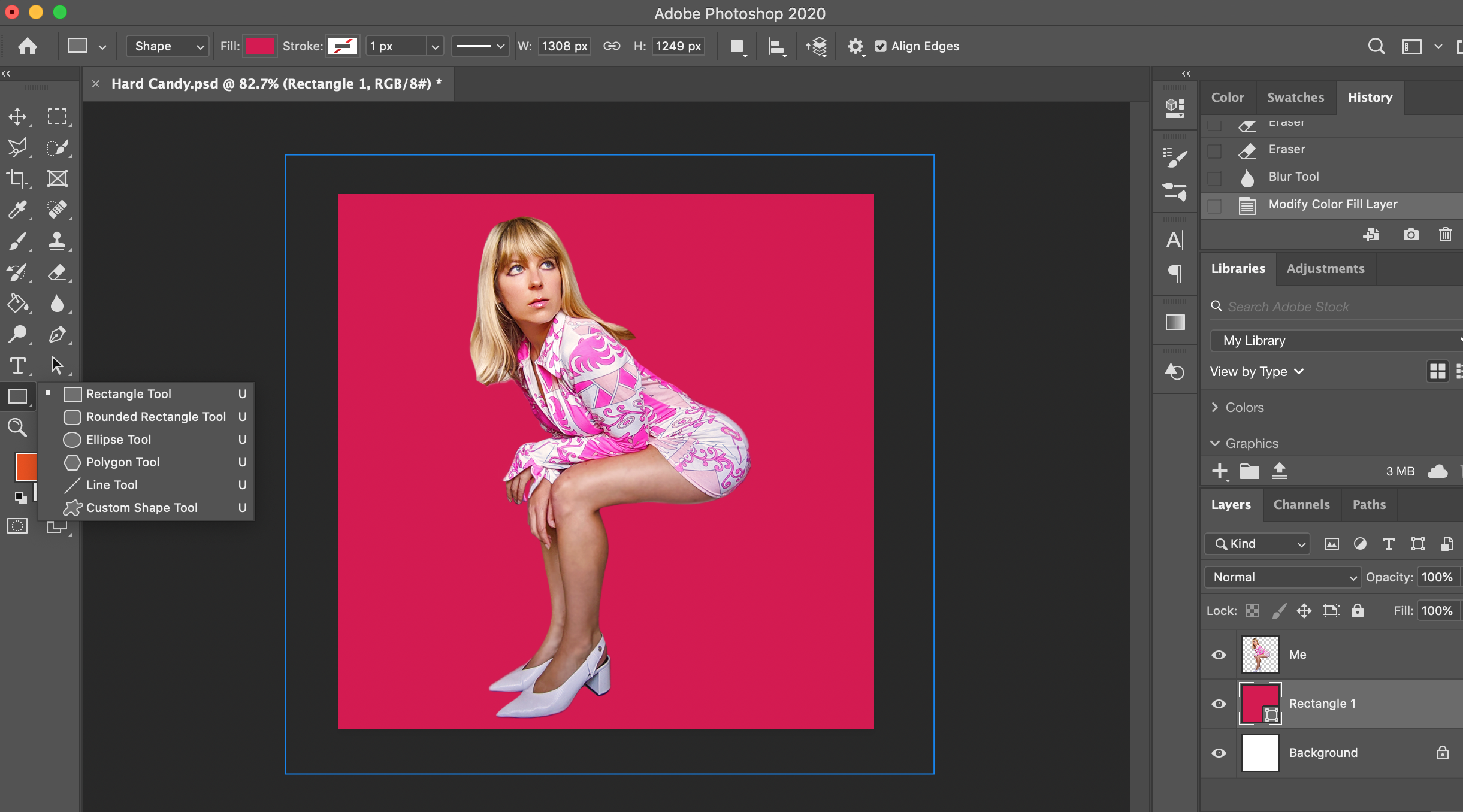
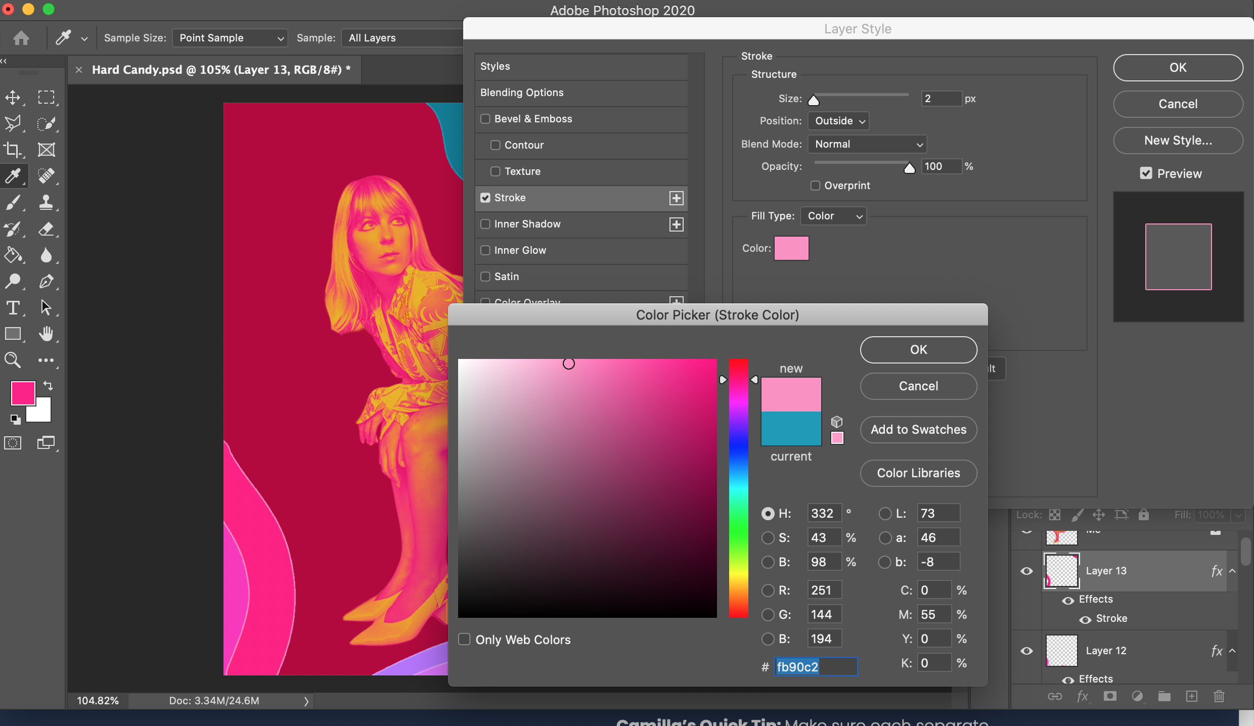
Step 4: Choose a background colour
You’ve got to have a bright AF background colour to make this edit pop - so find one that speaks to you, grab your Rectangle Tool, and lay that colour down as your “Background” colour in a layer behind your image. Don’t forget, you can always go back and change this colour if it doesn’t work first time round (I almost always do,) but it’s a great starting point to guide you as you go.
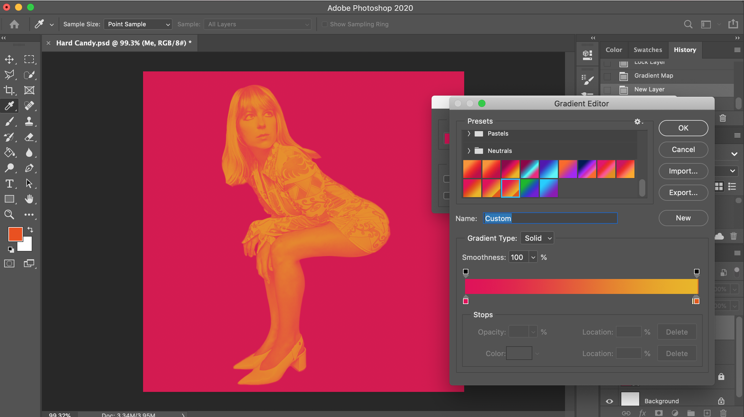
Step 5: Gradient Mapping!
This is an optional step, but if you’d like your image to have that late sixties concert vibe a-la-1967-San-Francisco, go ahead and select the “Gradient Map” option under the Image - Adjustments tab.
I tend to mix colours of my own choice to achieve the outcome I want, but there are loads of preset options for you to choose from here which work really nicely too.
Illustrating is where the fun happens!
Time to add in those colour strokes!
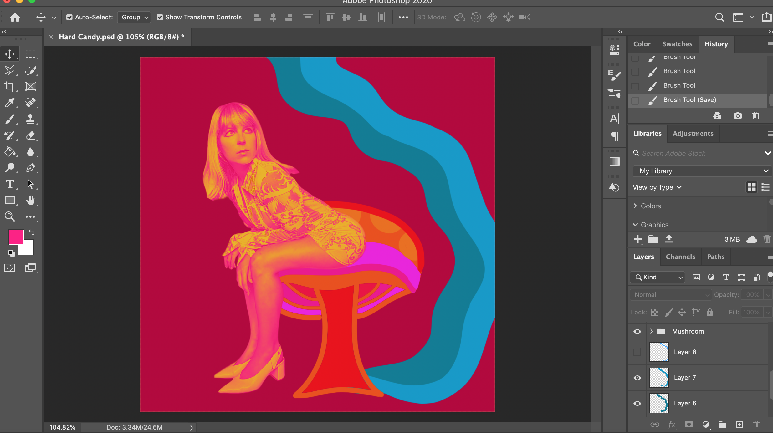
Step 6: Block out colours for your illustrations
This is where your creativity can seriously come to life (and it’s my favourite part of the editing process!)
For this piece, I’ve been very inspired by Alice in Wonderland and the beyond-this-world “acid bright” colours that were so popular in the late ‘60s. All you do is simply grab a dense brush, choose some colours, and get to painting! Paint whatever comes to your mind, and don’t think too much about it. Just let your mind and the brush flow.
Camilla’s Quick Tip:
Once you’ve illustrated your heart out, I like to outline my illustrations (again, you don’t have to do so if it doesn’t suit what you’re doing) - or in Photoshop terms, a “Stroke,” and then choose a colour that suits this look. E.g. If you’ve got a dark pink shape, perhaps add a light pink stroke to bring out the colours a bit more. Don’t make the size of the stroke too big either - it needs to just be an outline!
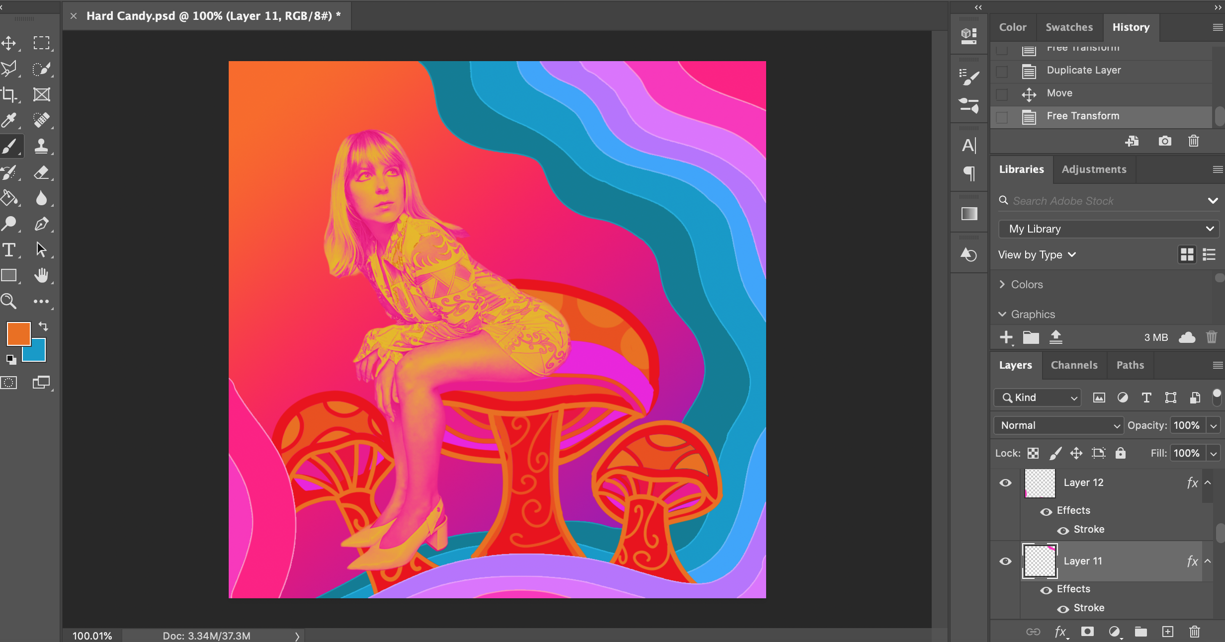
Step 7: Let your imagination go nuts
As you can see, I’ve let my creativity take the lead here. I decided I didn’t want a block colour background, so I’ve now added in a new gradient colour which I prefer.
Not only that, I’ve created some more illustrative elements such as the mushrooms and winding lines of colours on the right side of the piece. I’ve done these by just blocking in the colours I want, bucket filling in the spaces where I want additional colours, and adding little swirl details on top as I see fit.
Camilla’s Quick Tip: If you’re having an artist’s block or don’t know what to create, search up some images by an artist you love (mine are Peter Max and Andy Warhol) and draw inspiration from their choice of colours, styles and elements.
Block out the colours and general shapes you want with the brush tool using a hard and dense brush
Add in some colours to pick and paint from while you play and illustrate!
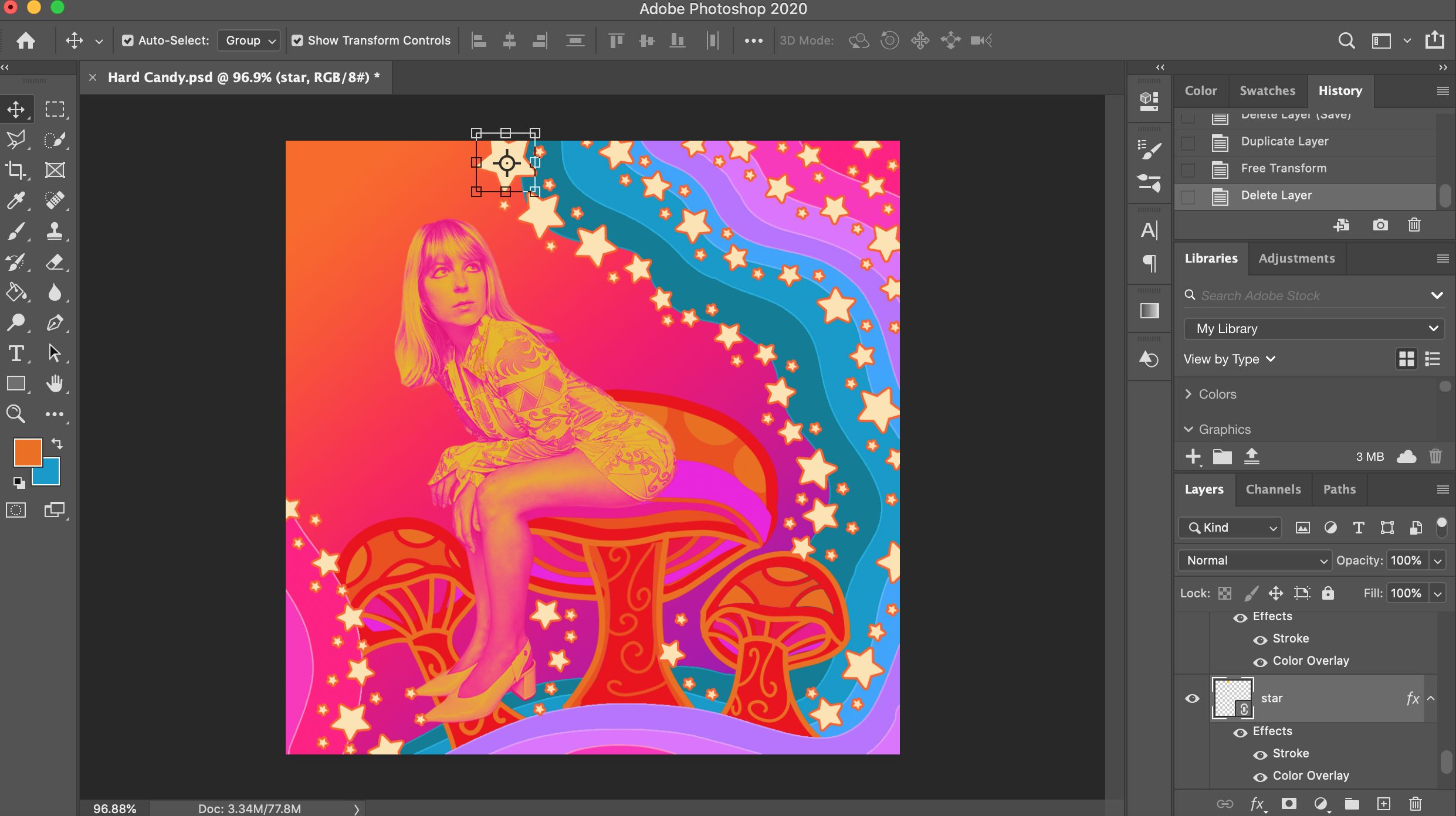
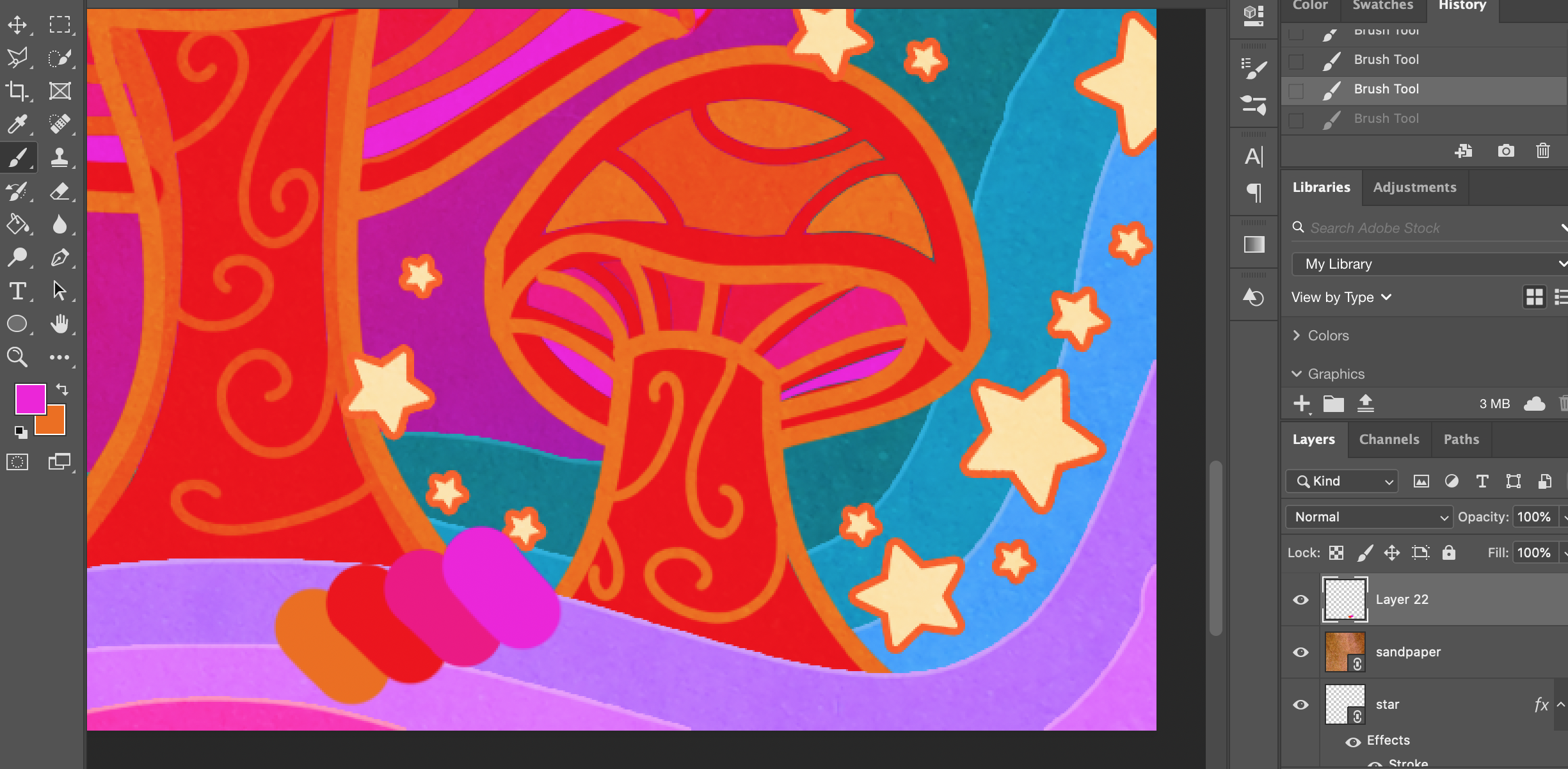
Add as many or as few stars as you like
Step 8: All the stars are closerrrr…..
Now a staple of my digital art (thanks Peter Max!) stars are my little way of ‘garnishing’ a piece of art and truly making it my own.
You can either make an image of a star, or download a vector version that you can then import into Photoshop to make life a bit simpler. You can grab these vectors from The Noun Project, Iconmonstr, and Flaticon to name a few.
Add a couple hundred (just kidding, however many you want!) of these all over your image, and resize them as you wish. Don’t forget to re-colour them and add a colour stroke to them while you’re at it!
Step 9: Finishing Touches
Nearly done! Great job and I hope you’ve hung in there with me.
Last of all, if you want to add in any rustic looking effects to make your image look a touch more ‘authentic’, I recommend going to Google and punching in “Sandpaper,” grabbing an image, and dropping it in over the top of your image (as the very top layer).
Once you’ve done that, select the sandpaper layer, then under the “Layers” tab on the far right where it says “Normal",” choose “Overlay” or “Soft Light,” and adjust the opacity to a level that you like. Play around with this until you achieve an effect that looks good to you.
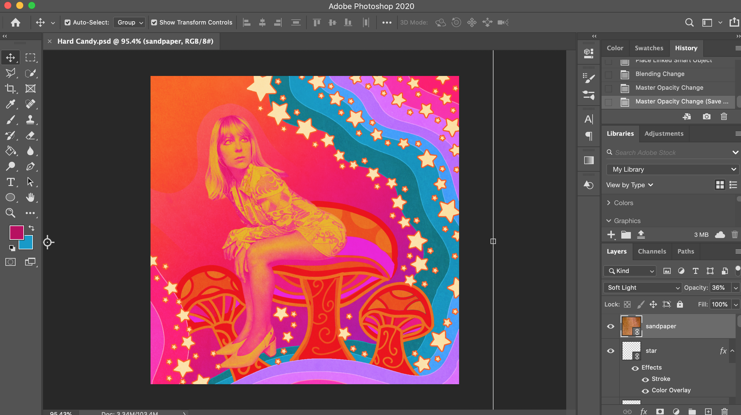
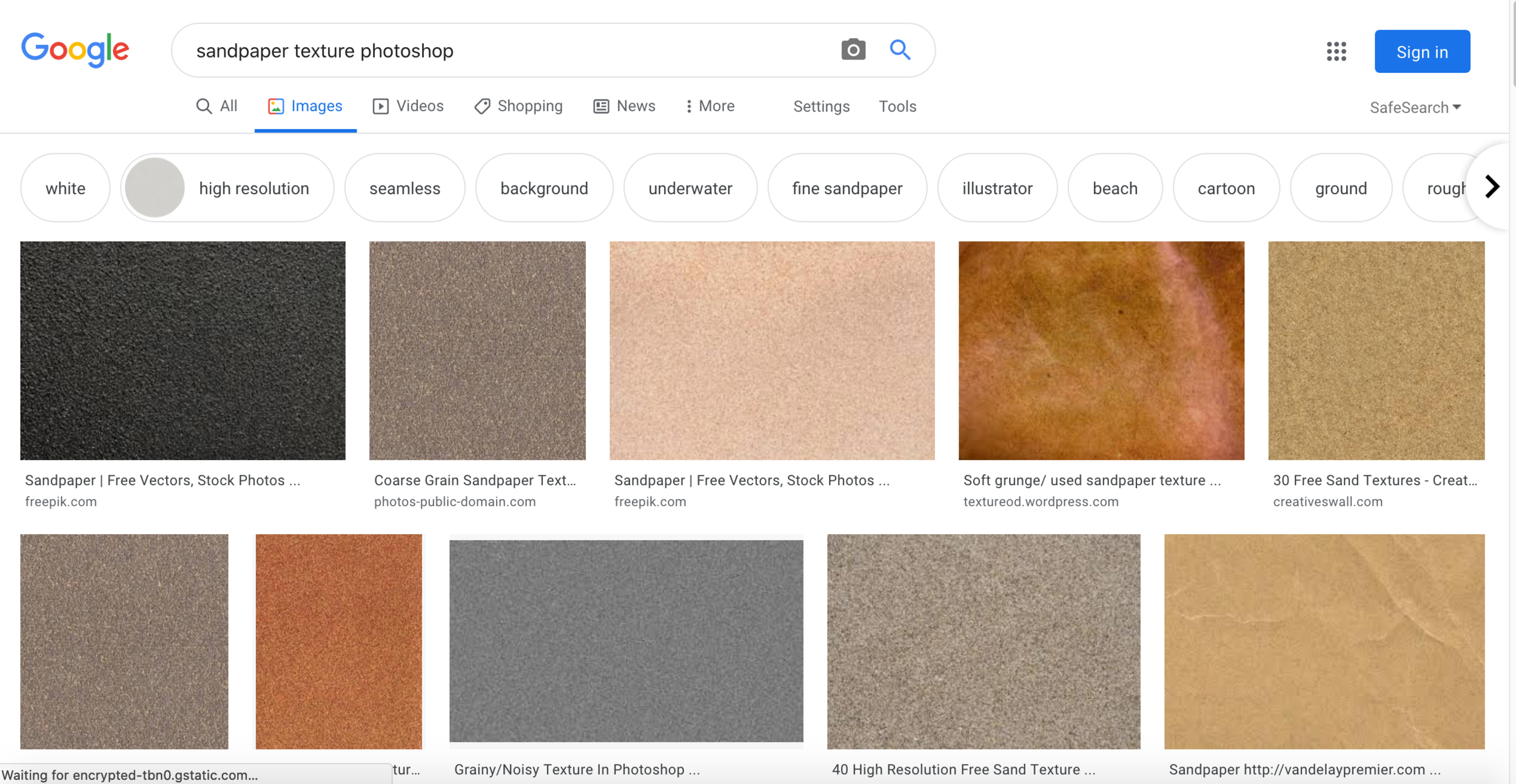
Sandpaper texture options on Google for extra retro vibes
Guess what? You’ve just finished your edit!
I hope you had fun and got to create something awesome! If you’ve got any questions or would like to see more tutorials like this, let me know in a comment below! I’d love to see what you created too :)
Until next time, keep safe, healthy and creative!
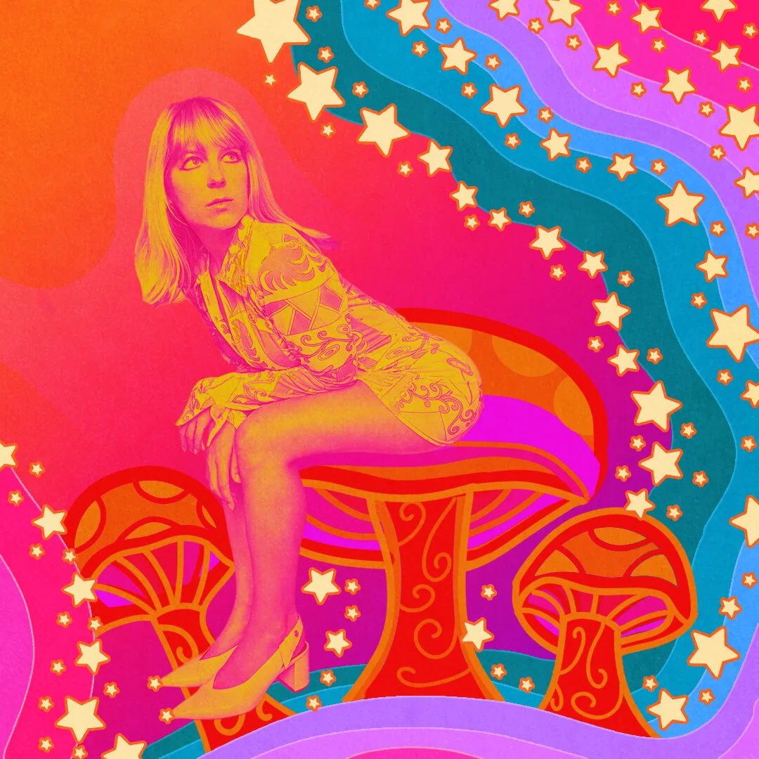
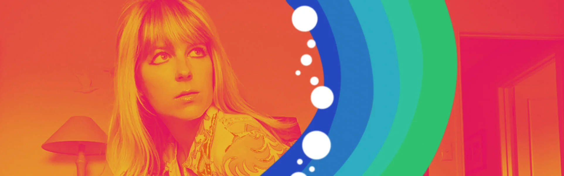
Et voila! The finished piece.